
Well, they've done it again. The authority on all things color, Pantone has caused a minor stir in the fashion and design world be releasing a pair of complementary hues for their latest iteration of Color(s) of the Year. I must have made my mild obsession with color pretty clear, because I've already received a handful of messages asking my opinion on the concept (how flattering!). My first thought? "Well, duh."
That's not to say I could have predicted the exact colors Pantone would select (unlike some wizards who apparently could), but people have been clamoring for the softer and warmer tones for some time now -- you might have heard of the resurgence of rose gold, for example. So I'm totally on board with Quartz.
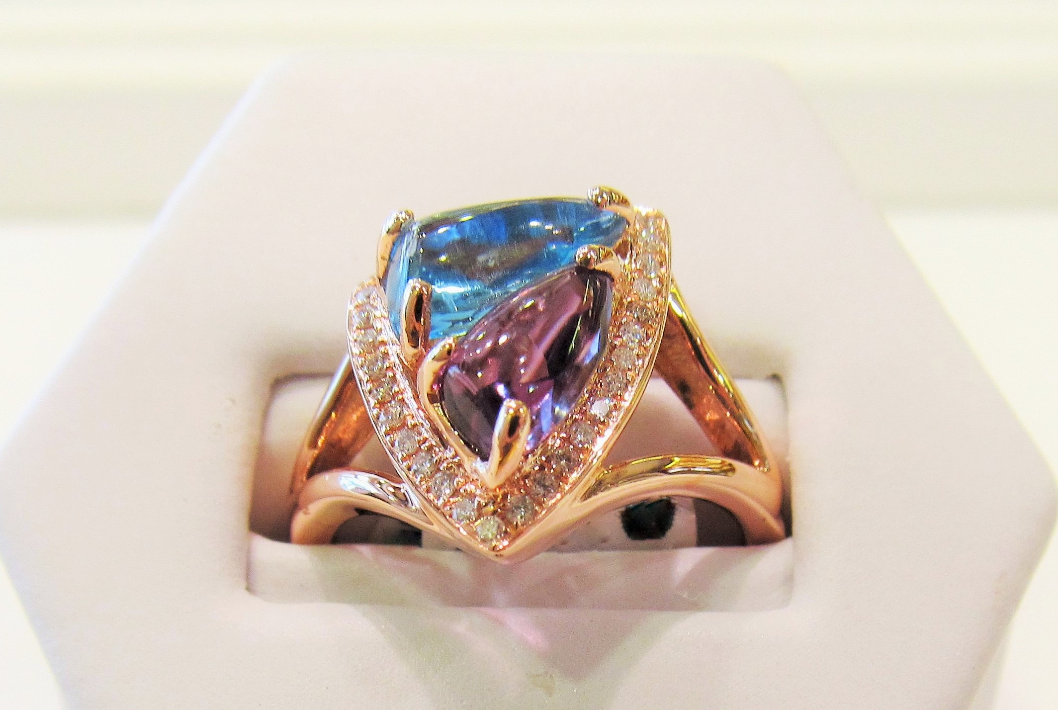
Serenity, on the other hand, is a tougher sell for me. Not the color itself -- my favorite color is blue, after all -- but the indication that little miss quartz needs a co-star at all.
Sure, I understand the balanced-genderized-color-tone argument. And the colors swirl together in a very graceful, artistic way, which will be seen as a godsend for the fashion world after the struggles with last year's color, Marsala. But I would have liked to see Quartz stand alone, to prove that the consumer world can handle a pastel in all its quiet, refined glory.
Nonetheless, prepare thyselves for an even greater influx of all things morganite and moonstone. They're beautiful, easy to style, and they're here to stay.